Week 4 - Exercises
[1]:
import numpy as np
import matplotlib.pyplot as plt
plt.style.use('bmh')
Exercise 1 - Simple bar chart
Thirty days has September,April, June, and November,All the rest have thirty-one,Save February at twenty-eight,But leap year, coming once in four,February then has one day more.
Plot a bar chart to show how many days each month has in a normal year. The x-axis should label each bar with the respective month and the y-axis should be labelled ‘Number of days’, with the height of the bar reflecting the number of days in the month.
HINT: You can type out the data and labels yourself, or if you want to be fancy, you can access them via the standard library’s calendar module.
[ ]:
Exercise 2 - Scatterplot detective
In the data folder of the course materials, there is a file called mystery.csv, whose data hold a long forgotten secret. A secret now that only a scatterplot can tell.
Load the data using numpy, and plot the first column against the second column to solve the mystery.
HINT Assuming you have mystery.csv in the data folder and that you have already imported numpy as np and matplotlib.pyplot as plt, you can do this in two lines of code.
[ ]:
Exercise 3 - Manchester rainfall
A friend has asked your advice on the best time of year to visit Manchester. You know that this person hates rain and loves warm days. After a quick search, you find the following data for average monthly rainfall and temperature in Manchester.
Jan |
Feb |
Mar |
Apr |
May |
Jun |
Jul |
Aug |
Sep |
Oct |
Nov |
Dec |
|
|---|---|---|---|---|---|---|---|---|---|---|---|---|
Rainfall (mm) |
70 |
50 |
60 |
55 |
55 |
65 |
65 |
75 |
70 |
95 |
80 |
80 |
Temperature (°C) |
4.5 |
4.9 |
6.6 |
8.8 |
11.8 |
14.5 |
16.4 |
16.1 |
13.8 |
10.6 |
7.2 |
4.7 |
Make a plot that you can share with your friend that will help them to decide which month to visit.
HINT: plt.subplots, or plt.twinx
[ ]:
Exercise 4 - Pacman pie
Here’s another good use of a pie chart.
[5]:
from IPython import display
display.Image('../images/pacman.jpg')
[5]:
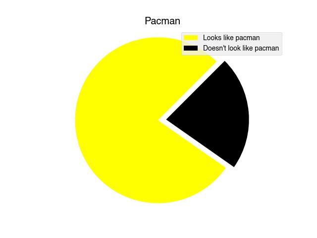
Write the code that makes the above pie chart.
[ ]:
Exercise 5 - Image processing
This week we saw how to use numpy and matplotlib to display an image and then to show the red, green and blue components separately. This was done by creating copies of the array and nulling out the other channels.
[7]:
img = plt.imread('../images/IMG_0756.jpg')

# Make a figure with three axes in a single row
fig, axs = plt.subplots(1, 3, figsize=(12, 6))

# Copy of image for red, green and blue pixel components
red = img.copy()
green = img.copy()
blue = img.copy()


# Get rid of other components
red[:,:,[1,2]] = 0  # Null out green and blue
green[:,:,[0,2]] = 0  # Null out red and blue
blue[:,:,[0,1]] = 0  # Null out red and green


# Display each new image
axs[0].imshow(red)
axs[1].imshow(green)
axs[2].imshow(blue);
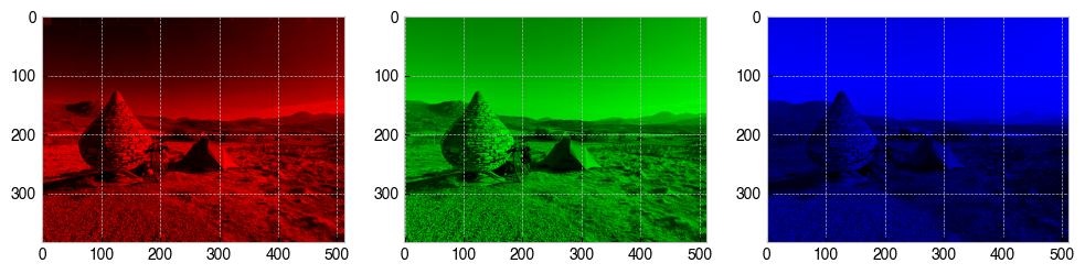
What happens to the image when you only null out one of the RGB channels, instead of two? Modify the above code so that it makes three more copies of the image where only a single channel is nulled. Display the new images in an extra row of subplots beneath the red, green and blue images.
[ ]: